Alignment and Theming in Jetpack Compose

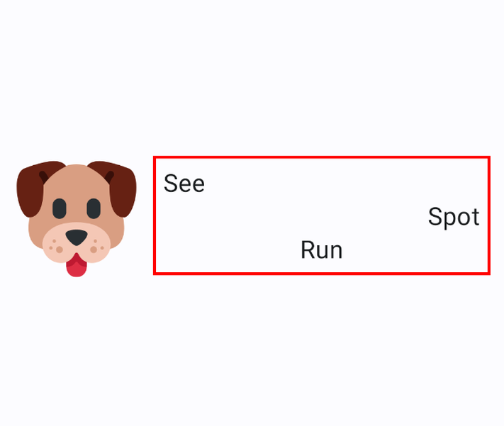
A dog next to a tricky layout saying 'See Spot Run' Image by Sepideh Miller with icon from SvgRepo

When people first start using Jetpack Compose to create Android views, they frequently do not know how to use the theming for their compose project, and they use more layout composables than necessary.

After the Women Who Code open source project earlier this year, several people asked me to write an article on writing better layouts in Compose.

Creating a Theme

If we create a new Compose project in Android Studio, it should have a ui.theme directory that defines the Compose theme. If we are adding a theme to an existing project, we can use Material Theme Builder to build a new Material Theme for the project.

DirectoryHierarchy.png

The theme directory will contain a Color.kt, a Theme.kt, and a Type.kt. The Color.kt is used to define colors for the project. The Theme.kt can help us set up color schemes for light and dark mode. The Type.kt helps us define our typography so we do not have to set it on every single Text that we create in Compose.

Once our theme is complete, we can use it to keep the look and feel of our app consistent.

1
2
3
4
5
6
7
8
NasaImagesTheme {
    Surface(
        modifier = Modifier.fillMaxSize(),
        color = MaterialTheme.colorScheme.background
    ) {
           MainScreen()
    }
}

In the snippet above NasaImagesTheme is set, and then we can use MaterialTheme to access the colors for the surface of our view without getting the color from our colors.xml file like below:

1
2
3
4
5
6
7
8
NasaImagesTheme {
    Surface(
        modifier = Modifier.fillMaxSize(),
        color = colorResource(id = R.color.teal_200) 
    ) {
           MainScreen()
    }
}

Instead of

1
2
3
4
5
Text(
    text = label,
    modifier = Modifier.align(Alignment.CenterVertically),
    fontSize = 14.sp,
)

we can use

1
2
3
4
5
Text(
    text = label,
    modifier = Modifier.align(Alignment.CenterVertically),
    style = MaterialTheme.typography.bodyMedium
)

This will keep our fonts consistent in the app so we never have to wonder if we are using the wrong font or the wrong size of font.

Using Layout Composables

The first Layout Composables that we typically learn about are Box, Row, and Column. Using too many of these may not create the same performance hit that deep view hierarchies create, but they can leave our layouts overly complicated and difficult to understand.

For example, some folks who are new to Compose may end up with

 1
 2
 3
 4
 5
 6
 7
 8
 9
10
11
12
13
14
15
16
17
18
19
20
Column(modifier = Modifier.padding(paddingValues = innerPadding)) {
    Box(
        modifier = Modifier.fillMaxWidth(),
        contentAlignment = Alignment.Center
    ) {
        Text("See")
    }
    Box(
        modifier = Modifier.fillMaxWidth(),
        contentAlignment = Alignment.Center
    ) {
        Text("Spot")
    }
    Box(
        modifier = Modifier.fillMaxWidth(),
        contentAlignment = Alignment.Center
    ) {
        Text("Run")
    }
}

when

 1
 2
 3
 4
 5
 6
 7
 8
 9
10
Column(
    modifier = Modifier
        .padding(paddingValues = innerPadding)
        .fillMaxWidth(),
    horizontalAlignment = Alignment.CenterHorizontally
) {
    Text("See")
    Text("Spot")
    Text("Run")
}
can achieve the same thing with the horizontalAlignment parameter on the Column.

Using Spacers

Sometimes, when we use Compose, StackOverflow will tell us to use Spacer with a weight(1f) modifier to put an icon at the end of a row like this:

 1
 2
 3
 4
 5
 6
 7
 8
 9
10
11
12
13
14
15
16
17
18
19
@Composable
fun SettingsRow(title: String) {
    Row(
        modifier = Modifier.padding(4.dp),
    ) {
        Text(
            text = title,
            fontWeight = FontWeight.Medium,
            fontSize = 16.sp
        )
        Spacer(
            Modifier.weight(1f)
        )
        Icon(
            Icons.Default.KeyboardArrowRight,
            contentDescription = "Right Arrow",
        )
    }
}

However, we can use the horizontalArrangement parameter on the Row to eliminate the Spacer completely.

 1
 2
 3
 4
 5
 6
 7
 8
 9
10
11
12
13
14
15
16
17
@Composable
fun SettingsRow(title: String) {
    Row(
        modifier = Modifier.padding(4.dp),
        horizontalArrangement = Arrangement.SpaceBetween
    ) {
        Text(
            text = title,
            fontWeight = FontWeight.Medium,
            fontSize = 16.sp
        )
        Icon(
            Icons.Default.KeyboardArrowRight,
            contentDescription = "Right Arrow",
        )
    }
}

There are great developer documents that dive deeper into creating layouts in Compose.